Navigation Menu
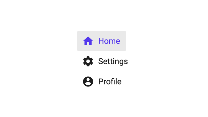
This is a nifty component that creates a navigation menu. Clicking an item will perform a navigation to the specified path and the correct item will be highlighted.

Basic usage
You specify the items of the menu by editing the Items array in the Navigation Menu component. Below is the default value.
[
  {
    // Icons are references to material icons,
    // see https://fonts.google.com/icons?selected=Material+Icons
    Icon: 'home',

    // The label to be shown on the nav item
    Label: 'Home',

    // The url to navigate to when clicked
    Url: '/home',

    // Setting this to true will indicate that this
    // item should be selected if there is no path
    // or if no other path matches
    IsHome: true,
  },
  {
    Icon: 'schedule',
    Label: 'Calendar',
    Url: '/calendar',
  },
];
-
Icon This is an icon identifier, you can find a list of all supported icons here.
-
Label The label for the menu item.
-
Url The path that should be navigated to when clicked.
-
IsHome This specifies if this menu item is the "home" item. It will be shown as selected of there is no path or none of the others match the current path.