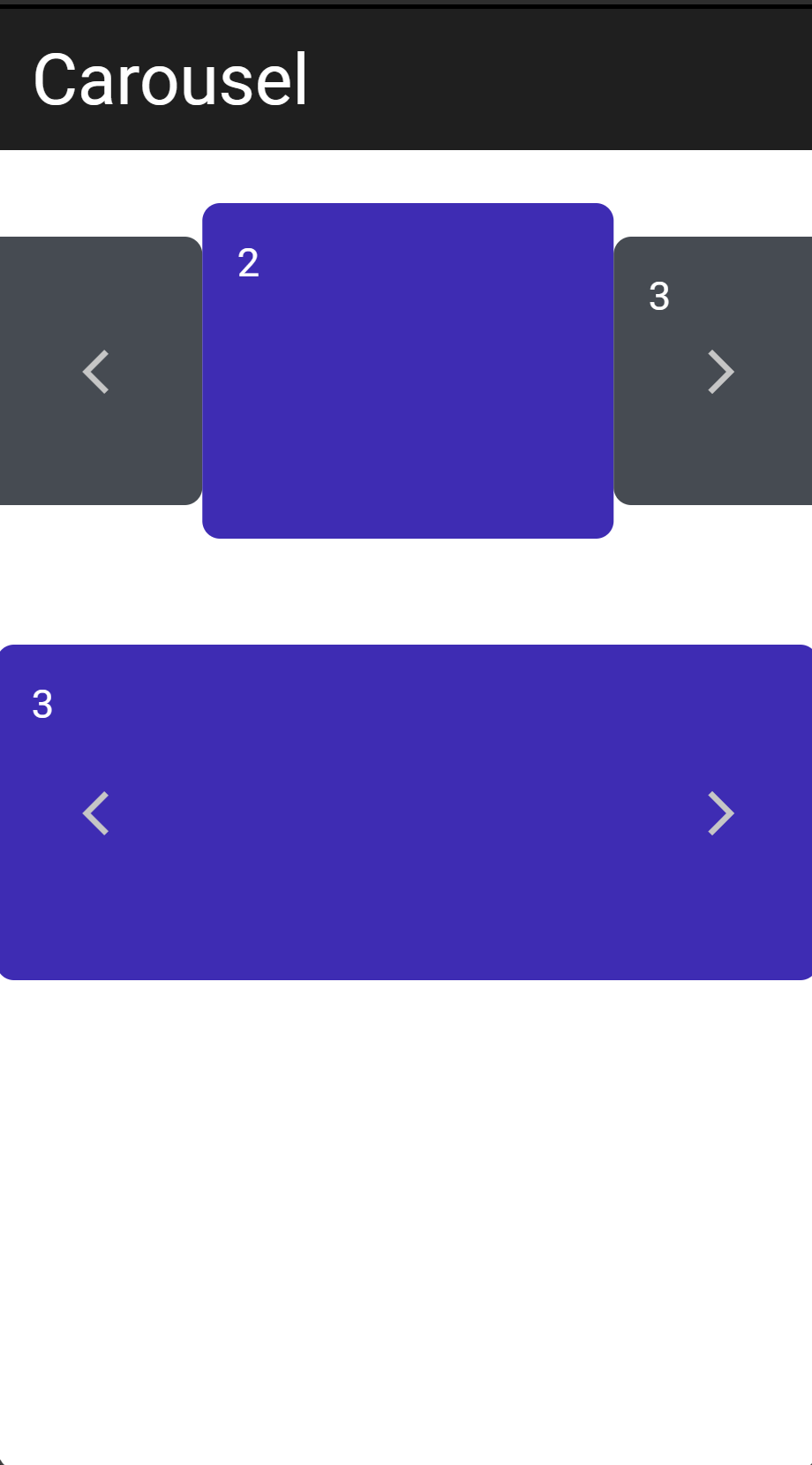
Carousel Scroll
This module contains a simple horizontal Carousel scroll with the following features:
- Can be scrolled by swiping horizontally or by clicking scroll buttons
- Can auto scroll
- One selected item that can be aligned to the left, to the center or to the right
- Easy to visually modify
Overview of what's included in the import project
When you import the module into your project you will get the following components:
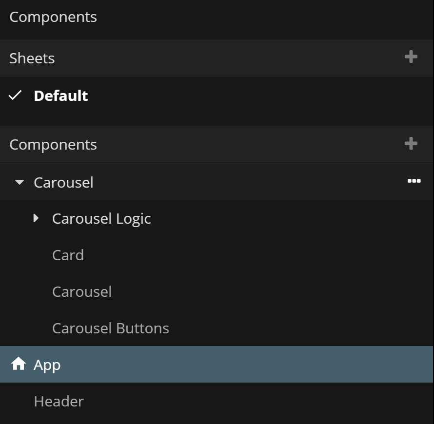
Carousel/Carousel Logic
This folder contains the logic that controls the scrolling of the application. This is needed by the Carousel component and you should generally not modify this unless you really know what you are doing :)
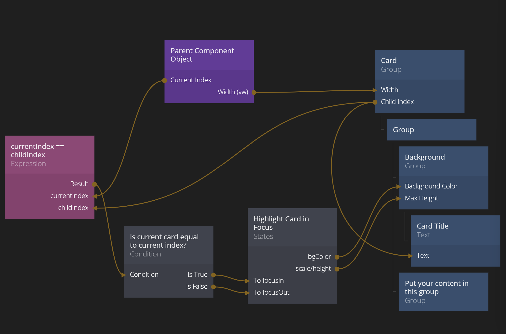
Carousel/Card
This component is the template for the card that represents an item in the Carousel list. You should base your own Carousel item on this Card, either by modifying this directly or making a copy of it. Feel free to change the structure of the component, however it's important to keep the Parent Component node and have the Width output connected to the Width of the main container of the Card. Also note the selection logic if you want the Card to change appearance if it's selected.
Carousel/Carousel
This is the main component that represents the Carousel list. You should generally not change anything major in this component unless you know what you are doing.
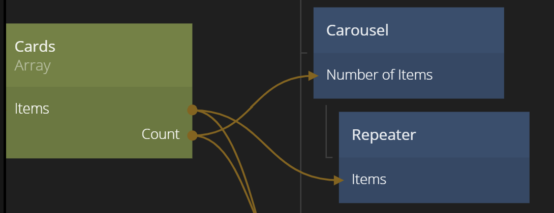
Note that the Carousel node should have its cards as direct children. This can be achieved by either manually putting them there or using a Repeater node.
Carousel Buttons
This component the two buttons that controls left/right scrolling. Feel free to style the Buttons according to your liking.
Using the snippet
You typically use the snippet by using the Carousel component more or less as it is and style the Card component to fit your app. The Carousel component have a few options available to tweak.
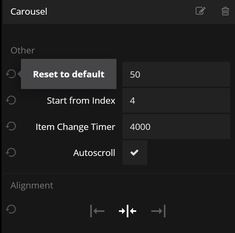
- Width - This is the width of each Carousel Card in the Carousel.
- Start from Index - The selected index from start.
- Item Change Timer - The delay between each autoscroll. Will only apply if Autoscroll is set to true.
- Autoscroll - A boolean that controls if the list should automatically scroll to the next item whenver the Item Change Timer expires.
The most impactful component to change is the Carousel Card. You can for example keep the background color Group node and then add your own content as children to the Group named Put your content in this group. Another option is to rebuild the card completely but the it's important to let the width stored in the Component Object control the width of the card.